WTF Is Up With Path's Clock?!?!

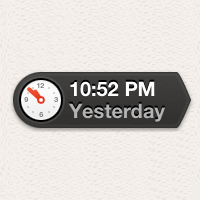
Ok, Path just put Facebook and a lot of other mobile products to shame with their new application. They’ve got a killer design, a number of relatively innovative interface elements, and the app works aside from the occasional crash and some buggy loading issues. However I haven’t been able to get over one element of their app that’s distracting as hell: the scrolling clock next to each story.
As you scroll down through your “path”, a clock rotates to show you the time that each story was published. It also takes up 25 to 40 percent of the width of the screen depending on the length of the text. As you start scrolling you can’t help but focus your eyes on the clock. It makes me wonder a number of things every time I load up the app (which is increasingly often because it’s currently a piece of digital candy for me), but the primary thought is this: why?
I love interesting little eye-catching design elements but typically you want those to pop out during an interaction that isn’t at the center of the experience. It adds personality to an application, but how long did it take a developer to get that to work? Also, is the exact time of when someone published their story really that critical? The fact that two people became friends on Path is not exactly time-sensitive information.
I think the concept of a private social network is an interesting one, but with such great execution on the product, I can’t help but wonder how that clock came to be. Perhaps there’s some inside joke I’m missing but the spinning clock serves as nothing more than a novel hack and a massive distraction.
Seems like commenters and other people I’ve spoken with think I’m way off base with this :) I still think the moving clock is ridiculous distracting.